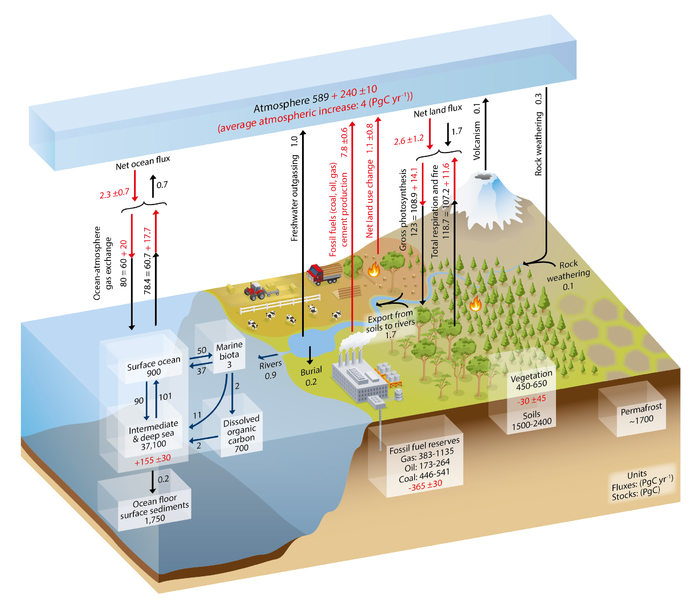
Obtained from IPCC, 2013: Climate Change 2013: The Physical Science Basis. Contribution of Working Group I to the Fifth Assessment Report of the Intergovernmental Panel on Climate Change [Stocker, T.F., D. Qin, G.-K. Plattner, M. Tignor, S.K. Allen, J. Boschung, A. Nauels, Y. Xia, V. Bex and P.M. Midgley (eds.)]. Cambridge University Press, Cambridge, United Kingdom and New York, NY, USA, 1535 pp. Chapter 6 contains this graphic.
Numbers represent reservoir mass, also called 'carbon stocks' in PgC (1 PgC = 1015 gC) and annual carbon exchange fluxes (in PgC yr–1). Black numbers and arrows indicate reservoir mass and exchange fluxes estimated for the time prior to the Industrial Era, about 1750. Red arrows and numbers indicate annual 'anthropogenic' fluxes averaged over the 2000–2009 time period. These fluxes are a perturbation of the carbon cycle during Industrial Era post 1750. Red numbers in the reservoirs denote cumulative changes of anthropogenic carbon over the Industrial Period 1750–2011. By convention, a positive cumulative change means that a reservoir has gained carbon since 1750. The cumulative change of anthropogenic carbon in the terrestrial reservoir is the sum of carbon cumulatively lost through land use change and carbon accumulated since 1750 in other ecosystems. Note that the mass balance of the two ocean carbon stocks Surface ocean and Intermediate and deep ocean includes a yearly accumulation of anthropogenic carbon (not shown). Uncertainties are reported as 90% confidence intervals.
A petagram is a billion metric tons. To put this in perspective, think about a train of railroad hopper cars full of coal. One hopper car will hold about 100 tons of coal which is about 80% carbon. If that hopper car is about 60 feet long (including the couplings), then a train hauling one petagram of carbon as coal would have to be about 156,500 miles long.
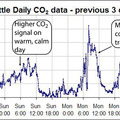
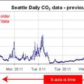
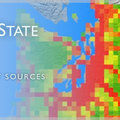
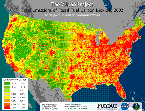
The largest source of CO2 to the atmosphere is associated with the burning of fossil fuels and cement manufacturing. A recent effort by the Vulcan project at Purdue University has made a detailed map of CO2 emissions in the United States at a 10km by 10km resolution. The map below shows that population centers are hot spots for CO2 emissions. The Seattle Metropolitan area is the largest source of fossil fuel emissions in the northwestern United States.
 |
| Carbon Cycle Figure provided by C. Sabine (NOAA/PMEL), Emission Figure provided by K. Gurney and Y. Zhou (Purdue University), text provided by C. Sabine (NOAA/PMEL). |

