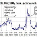
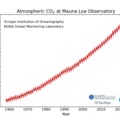
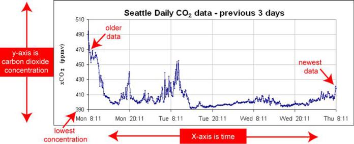
Scientists use graphs to efficiently show a lot of data. The graphs we show present the atmospheric CO2 concentration measurements collected over some time frame. The newest data are always shown on the right hand side of the graph with older measurements to the left; the higher the line on the graph the larger the CO2 concentration in the atmosphere. Using graphs like these, scientists can easily see how the atmospheric CO2 concentrations are changing up and down with time.
Figures and text provided by C. Sabine and S. Jones (NOAA/PMEL).
