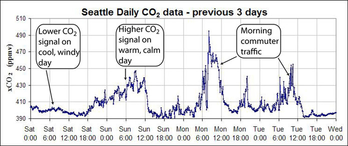
Scientists use graphs to efficiently show a lot of data. For example, on the daily graphs we can generally see a rise in CO2 on weekday mornings that we attribute to the CO2 emitted from cars during the morning commute. The afternoon rush hour is not as clear because the wind generally increases in the afternoon and mixes away the local build up of CO2. In the graph above we see relatively low CO2 values on Saturday and higher values on Sunday. This is primarily due to weather. This particular Saturday was relatively cool and windy so any signal of car exhaust from those that did venture out would have been blown away. On Sunday, however, it was sunny and warm with little wind. Many people were out driving and the lack of wind allowed the CO2 to build up around the city.
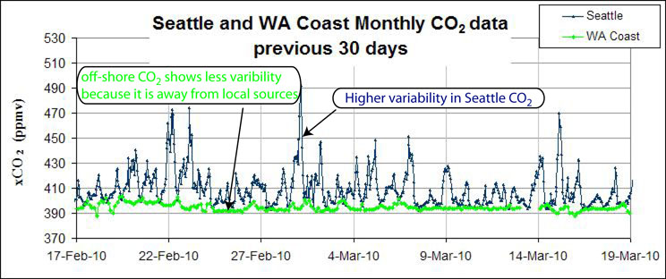
On the 30 day graph above, we see that the Seattle CO2 levels are always the same or higher than the background CO2 concentrations off the Washington Coast. The city CO2 values have much larger swings because the measurements are made much closer to the source of the CO2 emissions. The variability depends very much on the local weather and wind patterns and the level of activity in the city. For example, some of the highest CO2 levels have been observed on the weekends. We might have predicted that people coming to and from work during the week might be the largest source of CO2, but it seems that all the people out and about during the weekend can produce more CO2 than the weekday crowds. As stated earlier, this is very dependent on the weather patterns and what activities are happening in the city.

